반응형
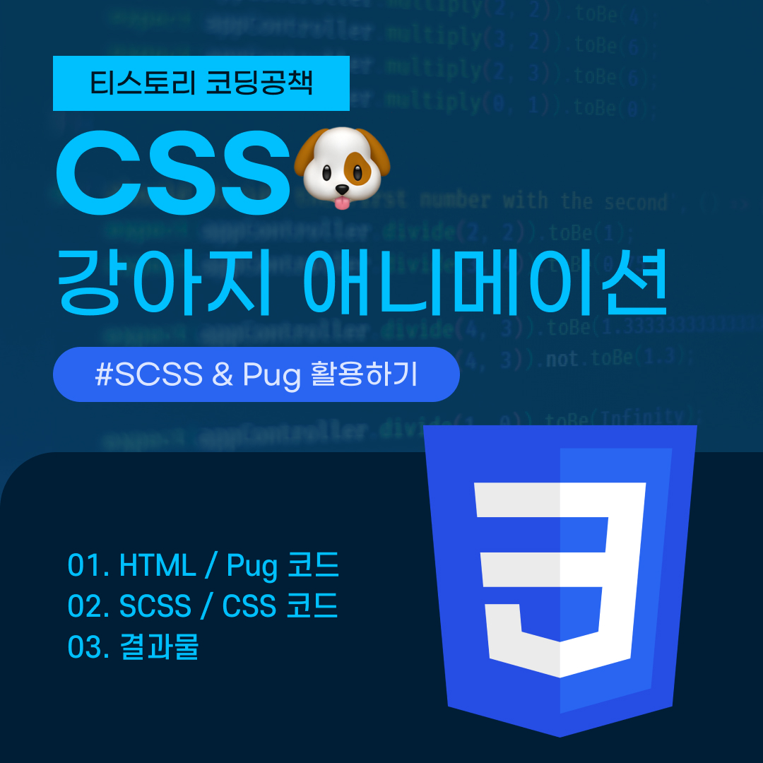
SCSS와 Pug를 이용해 강아지 애니메이션 만들기🐶🐾
이번 포스팅에서는 지난 포스팅에서 다뤘던 SCSS와 Pug를 이용하여 강아지 애니메이션을 만들어보도록 하겠다.
HTML(Pug) 코드
먼저 HTML 코드는 Pug 방식으로 틀을 짜주도록 하자.
.dog
.dog-body
	.dog-tail
		.dog-tail
			.dog-tail
				.dog-tail
					.dog-tail
						.dog-tail
							.dog-tail
								.dog-tail
.dog-torso
.dog-head
	.dog-ears
		.dog-ear
		.dog-ear
	.dog-eyes
		.dog-eye
		.dog-eye
	.dog-muzzle
		.dog-tongue
위의 Pug 코드를 HTML로 컴파일하기
위의 HTML(Pug) 코드를 보통의 HTML 코드로 컴파일 시킨 코드이다.
<div class="dog">
    <div class="dog-body">
      <div class="dog-tail">
        <div class="dog-tail">
          <div class="dog-tail">
            <div class="dog-tail">
              <div class="dog-tail">
                <div class="dog-tail">
                  <div class="dog-tail">
                    <div class="dog-tail"></div>
                  </div>
                </div>
              </div>
            </div>
          </div>
        </div>
      </div>
    </div>
    <div class="dog-torso"></div>
    <div class="dog-head">
      <div class="dog-ears">
        <div class="dog-ear"></div>
        <div class="dog-ear"></div>
      </div>
      <div class="dog-eyes">
        <div class="dog-eye"></div>
        <div class="dog-eye"></div>
      </div>
      <div class="dog-muzzle">
        <div class="dog-tongue"></div>
      </div>
    </div>
</div>
SCSS 코드
SCSS를 이용해 강아지와 애니메이션 효과 스타일 속성을 주었다.
코드 펼쳐보기
$dog-width: 100px;
$interval: 200ms;
$color-gray: #eaebec;
$easing: ease-in-out;

body {
  display: flex;
  flex-direction: column;
  justify-content: center;
  align-items: center;
}

html, body {
  background: #757575;
  width: 100%;
  height: 100%;
  margin: 0;
  padding: 0;
}

*, *:before, *:after {
  box-sizing: border-box;
  position: relative;
}

// dog
.dog {
    width: $dog-width;
    height: $dog-width;
    z-index: 1;

    &:before {
        content: '';
        display: block;
        position: absolute;
        width: 100%;
        height: 100%;
        border-radius: 50%;
        background: rgba(black, 0.3);
        transform: translatey(-30%) scale(1.5);
    }

    * {
        position: absolute;
    }
}

.dog-body, .dog-head, .dog-torso {
    border-radius: 50%;
    background: white;
    position: absolute;
    width: 100%;
    height: 100%;
}

// dog-body
.dog-body {
    top: -50%;
  box-shadow: inset 0 -15px 0 0 $color-gray;
  animation: dog-body $interval $easing infinite alternate;

    &:before {
        content:'';
        position: absolute;
        bottom: 90%;
        right: 50%;
        width: 70%;
        height: 70%;
        background: rgba(white, 0.4);
        border-top-left-radius: 100%;
        border-bottom-left-radius: 10%;
        border-top-right-radius: 10%;
        transform-origin: right bottom;
    animation: dog-tail-blur $interval $interval / 6 $easing infinite alternate both;

    @keyframes dog-tail-blur {
      0% {
        transform: rotate(0);
        opacity: 0;
      }
      50% {
        opacity: 1;
      }
      100% {
        opacity: 0;
        transform: rotate(90deg);
      }
    }
    }

  @keyframes dog-body {
    from {transform: translatex(-10%)}
    to {transform: translatex(10%)}
  }
}

// dog-head
.dog-head {
  animation: dog-head $interval * 9 cubic-bezier(0.11, 0.79, 0, 0.99) infinite;

  @keyframes dog-head {
    0% {transform: rotate(45deg)}
    33% {transform: rotate(-45deg)}
    66% {transform: rotate(0deg)}
    100% {transform: rotate(45deg)}
  }
}

// dog-torso
.dog-torso {
  top: -20%;
  box-shadow: inset 0 -15px 0 0 $color-gray;
  background: white;
  animation: dog-torso $interval $easing infinite alternate-reverse;

  @keyframes dog-torso {
    0% {transform: translatex(-5%)}
    100% {transform: translatex(5%)}
  }
}

// dog-eyes
.dog-eyes {
  width: 60%;
  top: 55%;
  left: 20%;
  z-index: 1;

  &:before {
    content: '';
    display: block;
    width: 40px;
    height: 40px;
    border-radius: 40px;
    background: #C6C6C6;
    position: absolute;
    top: -10px;
    left: -10px;
    z-index: 0;
    border: 4px solid white;
    border-left-width: 0;
    border-bottom-width: 0;
    border-top-width: 0;
    transform: rotate(-45deg);
  }
}

.dog-eye {
  width: 10px;
  height: 15px;
  border-radius: 50%;
  background: #000;
  z-index: 1;

  &:first-child {
    left: 0;
  }
  &:last-child {
    right: 0;
  }
}

// dog-muzzle
.dog-muzzle {
  width: 60%;
  left: 20%;
  height: 50%;
  border-bottom-left-radius: 100%;
  border-bottom-right-radius: 100%;
  bottom: -15%;
  background: white;

  &:before, &:after {
    content: '';
    display: block;
    position: absolute;
    left: calc(60% - 10px);
  }

  &:before {
    width: 6px;
    height: 20px;
    bottom: 0;
    background: $color-gray;
  }

  &:after {
    background: black;
    width: 20px;
    height: 15px;
    bottom: 12px;
    left: calc(50% - 10px);
    border-bottom-left-radius: 60% 60%;
    border-bottom-right-radius: 60% 60%;
    border-top-left-radius: 50% 40%;
    border-top-right-radius: 50% 40%;
  }
}

// dog-ears
.dog-ears {
  width: 40%;
  top: 25%;
  left: 30%;
}
.dog-ear {
  bottom: -10px;
  height: 50px;
  width: 50px;
  background: $color-gray;

  &:first-child {
    right: 100%;
    border-bottom-left-radius: 80%;
    border-top-right-radius: 80%;
    box-shadow: inset -15px 15px 0 1px white;
    transform: rotate(10deg);
  }
  &:last-child {
    left: 100%;
    border-bottom-right-radius: 80%;
    border-top-left-radius: 80%;
    box-shadow: inset 15px 15px 0 0 white;
    transform: rotate(-10deg);
  }
}

// dog-tongue
.dog-tongue {
  width: 40%;
  height: 100%;
  left: calc(50% - 20px);
  z-index: -1;
  transform-origin: center top;

  &:before {
    content: '';
    position: absolute;
    left: 8px;
    display: block;
    width: 100%;
    height: 100%;
    border-radius: 40px;
    background: #FF9B9B;
    animation: dog-tongue-inner $interval / 2 $easing infinite alternate;

    @keyframes dog-tongue-inner {
      from {transform: translatey(5%)}
      to {transform: translatey(22%)}
    }
  }
}

// dog-tail
.dog-tail {
  $tail-width: 22px;
  width: $tail-width;
  height: $tail-width * 1.1;
  background: white;
  bottom: 40%;
  border-radius: $tail-width / 2;
  left: calc(50% - #{$tail-width / 2});
  transform-origin: center bottom;

  .dog-tail {
    animation: dog-tail-segment $interval $easing infinite alternate;

    @keyframes dog-tail-segment {
      0% {transform: rotate(-10deg)}
      100% {transform: rotate(10deg)}
    }
  }
}

.dog-body > .dog-tail {
  bottom: 70%;
}
위의 SCSS 코드를 CSS로 컴파일하기
위의 SCSS 코드를 보통의 CSS 코드로 컴파일 시킨 코드이다.
코드 펼쳐보기
body {
  display: flex;
  flex-direction: column;
  justify-content: center;
  align-items: center;
}

html, body {
  background: #757575;
  width: 100%;
  height: 100%;
  margin: 0;
  padding: 0;
}

*, *:before, *:after {
  box-sizing: border-box;
  position: relative;
}

.dog {
  width: 100px;
  height: 100px;
  z-index: 1;
}
.dog:before {
  content: "";
  display: block;
  position: absolute;
  width: 100%;
  height: 100%;
  border-radius: 50%;
  background: rgba(0, 0, 0, 0.3);
  transform: translatey(-30%) scale(1.5);
}
.dog * {
  position: absolute;
}

.dog-body, .dog-head, .dog-torso {
  border-radius: 50%;
  background: white;
  position: absolute;
  width: 100%;
  height: 100%;
}

.dog-body {
  top: -50%;
  box-shadow: inset 0 -15px 0 0 #eaebec;
  animation: dog-body 200ms ease-in-out infinite alternate;
}
.dog-body:before {
  content: "";
  position: absolute;
  bottom: 90%;
  right: 50%;
  width: 70%;
  height: 70%;
  background: rgba(255, 255, 255, 0.4);
  border-top-left-radius: 100%;
  border-bottom-left-radius: 10%;
  border-top-right-radius: 10%;
  transform-origin: right bottom;
  animation: dog-tail-blur 200ms 33.3333333333ms ease-in-out infinite alternate both;
}
@keyframes dog-tail-blur {
  0% {
    transform: rotate(0);
    opacity: 0;
  }
  50% {
    opacity: 1;
  }
  100% {
    opacity: 0;
    transform: rotate(90deg);
  }
}
@keyframes dog-body {
  from {
    transform: translatex(-10%);
  }
  to {
    transform: translatex(10%);
  }
}

.dog-head {
  animation: dog-head 1800ms cubic-bezier(0.11, 0.79, 0, 0.99) infinite;
}
@keyframes dog-head {
  0% {
    transform: rotate(45deg);
  }
  33% {
    transform: rotate(-45deg);
  }
  66% {
    transform: rotate(0deg);
  }
  100% {
    transform: rotate(45deg);
  }
}

.dog-torso {
  top: -20%;
  box-shadow: inset 0 -15px 0 0 #eaebec;
  background: white;
  animation: dog-torso 200ms ease-in-out infinite alternate-reverse;
}
@keyframes dog-torso {
  0% {
    transform: translatex(-5%);
  }
  100% {
    transform: translatex(5%);
  }
}

.dog-eyes {
  width: 60%;
  top: 55%;
  left: 20%;
  z-index: 1;
}
.dog-eyes:before {
  content: "";
  display: block;
  width: 40px;
  height: 40px;
  border-radius: 40px;
  background: #C6C6C6;
  position: absolute;
  top: -10px;
  left: -10px;
  z-index: 0;
  border: 4px solid white;
  border-left-width: 0;
  border-bottom-width: 0;
  border-top-width: 0;
  transform: rotate(-45deg);
}

.dog-eye {
  width: 10px;
  height: 15px;
  border-radius: 50%;
  background: #000;
  z-index: 1;
}
.dog-eye:first-child {
  left: 0;
}
.dog-eye:last-child {
  right: 0;
}

.dog-muzzle {
  width: 60%;
  left: 20%;
  height: 50%;
  border-bottom-left-radius: 100%;
  border-bottom-right-radius: 100%;
  bottom: -15%;
  background: white;
}
.dog-muzzle:before, .dog-muzzle:after {
  content: "";
  display: block;
  position: absolute;
  left: calc(60% - 10px);
}
.dog-muzzle:before {
  width: 6px;
  height: 20px;
  bottom: 0;
  background: #eaebec;
}
.dog-muzzle:after {
  background: black;
  width: 20px;
  height: 15px;
  bottom: 12px;
  left: calc(50% - 10px);
  border-bottom-left-radius: 60% 60%;
  border-bottom-right-radius: 60% 60%;
  border-top-left-radius: 50% 40%;
  border-top-right-radius: 50% 40%;
}

.dog-ears {
  width: 40%;
  top: 25%;
  left: 30%;
}

.dog-ear {
  bottom: -10px;
  height: 50px;
  width: 50px;
  background: #eaebec;
}
.dog-ear:first-child {
  right: 100%;
  border-bottom-left-radius: 80%;
  border-top-right-radius: 80%;
  box-shadow: inset -15px 15px 0 1px white;
  transform: rotate(10deg);
}
.dog-ear:last-child {
  left: 100%;
  border-bottom-right-radius: 80%;
  border-top-left-radius: 80%;
  box-shadow: inset 15px 15px 0 0 white;
  transform: rotate(-10deg);
}

.dog-tongue {
  width: 40%;
  height: 100%;
  left: calc(50% - 20px);
  z-index: -1;
  transform-origin: center top;
}
.dog-tongue:before {
  content: "";
  position: absolute;
  left: 8px;
  display: block;
  width: 100%;
  height: 100%;
  border-radius: 40px;
  background: #FF9B9B;
  animation: dog-tongue-inner 100ms ease-in-out infinite alternate;
}
@keyframes dog-tongue-inner {
  from {
    transform: translatey(5%);
  }
  to {
    transform: translatey(22%);
  }
}

.dog-tail {
  width: 22px;
  height: 24.2px;
  background: white;
  bottom: 40%;
  border-radius: 11px;
  left: calc(50% - 11px);
  transform-origin: center bottom;
}
.dog-tail .dog-tail {
  animation: dog-tail-segment 200ms ease-in-out infinite alternate;
}
@keyframes dog-tail-segment {
  0% {
    transform: rotate(-10deg);
  }
  100% {
    transform: rotate(10deg);
  }
}

.dog-body > .dog-tail {
  bottom: 70%;
}
결과물
강아지 애니메이션 완성 결과물이다🐶🐾
반응형
'CSS' 카테고리의 다른 글
| [CSS] CSS 단위 종류 및 고찰 (12) | 2022.08.23 |
|---|---|
| [CSS] 이미지 스프라이트 + 백그라운드 & IR 효과 (4) | 2022.08.20 |
| [CSS] Sass(SCSS) 알아보기 (3) | 2022.08.18 |
| [CSS] 기본 문법 - 스타일시트를 불러오는 방법들 정리 (4) | 2022.08.14 |
| [CSS] 미디어 쿼리 활용하기 (7) | 2022.08.14 |


댓글