반응형
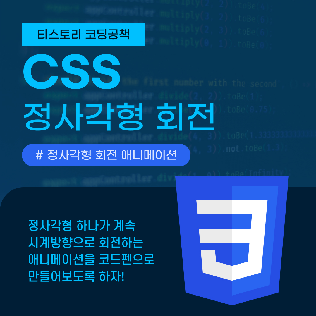
정사각형이 회전하는 애니메이션 만들기⬜
이번 포스팅에서는 정사각형이 시계방향으로 계속 돌아가는 간단한 애니메이션을 만들어보도록 하겠다.
HTML 코드
HTML 코드는 매우 간단하다. box 클래스값을 가진 div만 넣는다.
<div class="box"></div>
CSS 코드
linear-gradient로 그라디언트 효과 배경을 사용할 수 있으며 position 속성과 animation, @keyframes 등을 잘 활용하여 애니메이션을 완성시킬 수 있다.
body {
    height: 100vh;
    background-image: linear-gradient(to top, goldenrod, darkkhaki)
  }

  .box {
    width: 50px;
    height: 50px;
    position: absolute;
    top: 0;
    left: 0;
    right: 0;
    bottom: 0;
    margin: auto;
  }

  .box::before {
    content: '';
    width: 50px;
    height: 5px;
    background: #000;
    position: absolute;
    top: 58px;
    left: 0;
    border-radius: 50%;
    opacity: 0.2;
    animation: shadow 0.6s linear infinite;
  }

  @keyframes shadow {
    0% {
      transform: scale(1, 1);
    }
    50% {
      transform: scale(1.2, 1);
    }
    100% {
      transform: scale(1, 1);
    }
  }

  .box::after {
    content: '';
    background: khaki;
    width: 50px;
    height: 50px;
    position: absolute;
    left: 0;
    top: 0;
    border-radius: 3px;
    animation: load 0.6s linear infinite;
  }

  @keyframes load {
    17% {
      border-bottom-right-radius: 3px;
    }
    25% {
      transform: translateY(9px) rotate(22.5deg);
    }
    50% {
      transform: translateY(18px) scale(1, 0.9) rotate(45deg);
      border-bottom-right-radius: 40px;
    }
    75% {
      transform: translatey(9px) rotate(67.5deg);
    }
    100% {
      transform: translatey(0px) rotate(90deg);
    }
  }
결과물
왠지 이거 보니까 팬케이크가 떠오르지 않나요? 🥞
반응형
'CSS' 카테고리의 다른 글
| [CSS] 애니메이션 종류와 사용 방법 총정리 (7) | 2022.09.07 |
|---|---|
| [CSS] 공이 정신없이 튀는 애니메이션 만들기 (2) | 2022.09.02 |
| [CSS] 원 2개가 시계방향으로 회전하는 애니메이션 만들기 (4) | 2022.08.29 |
| [CSS] 요소 숨기는 방법 알아보기 (9) | 2022.08.25 |
| [CSS] 색상 표현하는 방법 알아보기 (8) | 2022.08.23 |


댓글